Because the variances are 1, the resulting data will have a correlation of \[\rho = \frac{\text{cov}(y, x)}{\sigma_y\sigma_x} = \frac{.5}{1\times1} = .5.\]
For every test observation \(x_0\) the \(K\) points that are close to \(x_0\) are identified.
These closest points form set \(\mathcal{N}_0\).
We estimate the probability for \(x_0\) being part of class \(j\) as the fraction of points in \(\mathcal{N}_0\) for whom the response equals \(j\): \[P(Y = j | X = x_0) = \frac{1}{K}\sum_{i\in\mathcal{N}_0}I(y_i=j)\]
The observation \(x_0\) is classified to the class with the largest probability
In short
An observation gets that class assigned to which most of its \(K\) neighbours belong
Why KNN?
Because \(X\) is assigned to the class to which most of the observations belong it is
non-parametric
no assumptions about the distributions, or the shape of the decision boundary
expected to be far better than logistic regression when decision boundaries are non-linear
However, we do not get parameters as with LDA and regression.
We thus cannot determine the relative importance of predictors
The “model” == the existing observations: instance-based learning
# A tibble: 100 × 4
      x1    x2 class set
   <dbl> <dbl> <chr> <chr>
 1  5.90  6.13 C     Test
 2  8.02  6.97 C     Train
 3  7.07  8.19 C     Test
 4  3.62  5.40 A     Train
 5  2.72  5.89 A     Train
 6  7.78  7.16 C     Test
 7  5.42  3.71 B     Test
 8  6.43  8.08 C     Train
 9  4.97  1.73 B     Test
10  4.06  6.22 A     Test
# … with 90 more rows
Fitting a K-NN model
Then we split the data into a training (build the model) and a test (verify the model) set
train.data <-subset(sim.data, set =="Train", select =c(x1, x2))test.data <-subset(sim.data, set =="Test", select =c(x1, x2))obs.class <-subset(sim.data, set =="Train", select = class)
 [1] C C C B B A B B A A C C A A C A A C C C B C C B B A B B B B A B A B A C A C
[39] C B C C C A A C B C B A A B B C C A B B C C C B A B B C B A C A C B A
Levels: A B C
Now we predict the class of this new observation, using the entire data for training our model
knn(train = sim.data[, 1:2], cl = sim.data$class, k =10, test = newObs)
[1] B
Levels: A B C
K-means clustering
Remember: unsupervised
sim.data %>%ggplot(aes(x1, x2)) +geom_point()
Goal: finding clusters in our data
K-means clustering partitions our dataset into \(K\) distinct, non-overlapping clusters or subgroups.
What is a cluster?
A set of relatively similar observations.
What is “relatively similar”?
This is up to the programmer/researcher to decide. For example, we can say the “within-class” variance is as small as possible and the between-class variance as large as possible.
Why perform clustering?
We expect clusters in our data, but weren’t able to measure them
potential new subtypes of cancer tissue
We want to summarise features into a categorical variable to use in further decisions/analysis
subgrouping people by their spending types
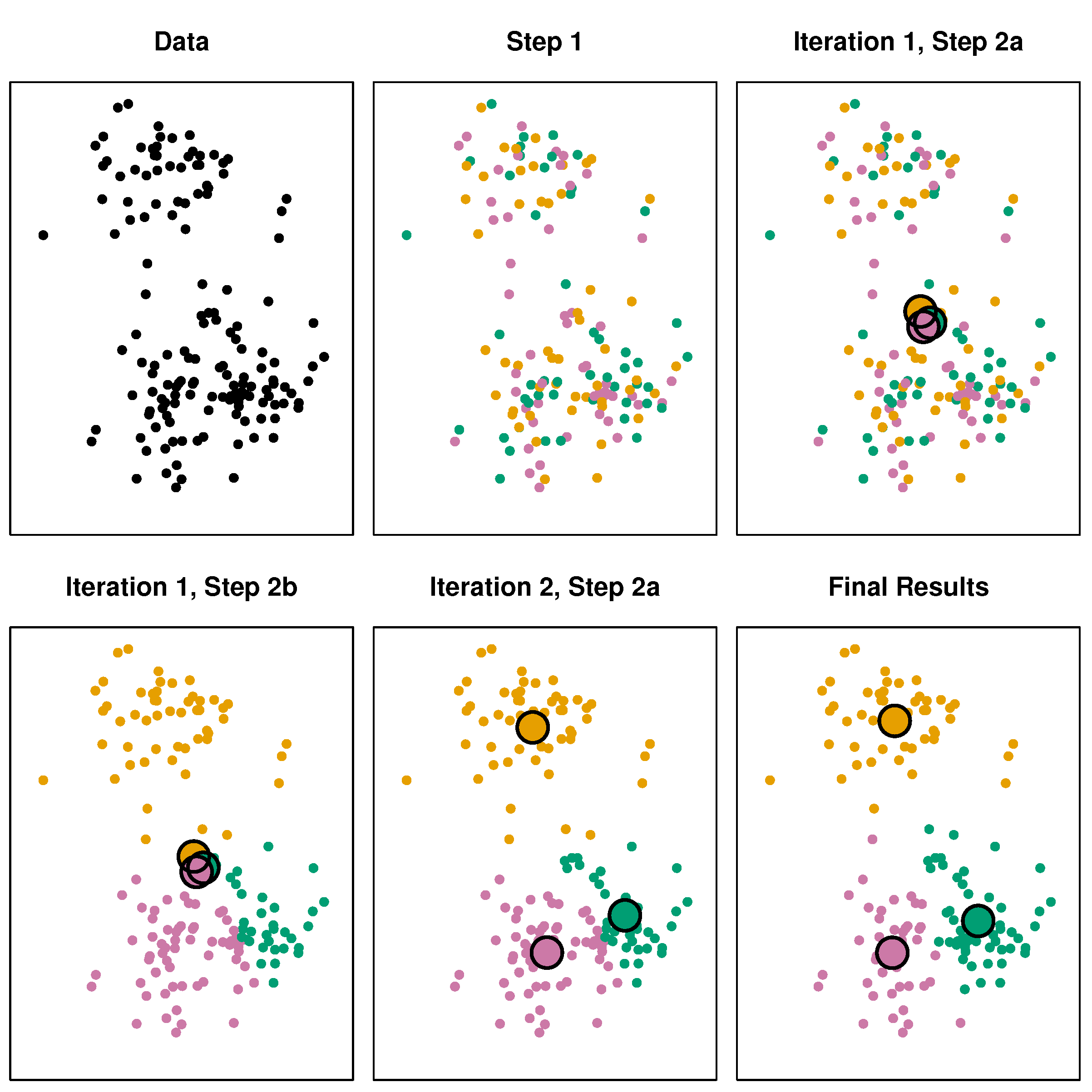
The k-means algorithm
Randomly assign values to K classes
Calculate the centroid (colMeans) for each class
Assign each value to its closest centroid class
If the assignments changed, go to step 2. else stop.