Practical A
We use the following packages in this Practical:
library(dplyr)     # for data manipulation
library(magrittr)  # for pipes
library(ggplot2)   # for visualization
library(mice)      # for the boys data
Exercises
Pipes
- Use a pipe to do the following:
- draw 1000 values from a normal distribution with
mean = 5andsd = 1- \(N(5, 1)\), - create a matrix where the first 500 values are the first column and the second 500 values are the second column
- make a scatterplot of these two columns
rnorm(1000, 5) %>%
  matrix(ncol = 2) %>%
  plot()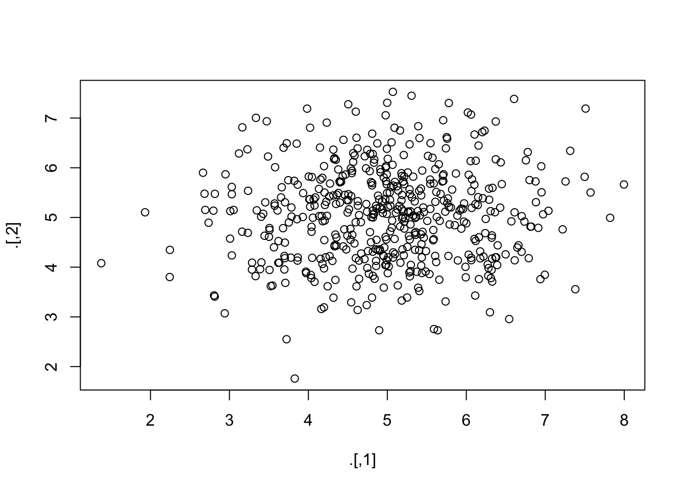
- Use a pipe to calculate the correlation matrix on the
anscombedata set
anscombe %>%
  cor()
x1 x2 x3 x4 y1 y2 y3
x1 1.0000000 1.0000000 1.0000000 -0.5000000 0.8164205 0.8162365 0.8162867
x2 1.0000000 1.0000000 1.0000000 -0.5000000 0.8164205 0.8162365 0.8162867
x3 1.0000000 1.0000000 1.0000000 -0.5000000 0.8164205 0.8162365 0.8162867
x4 -0.5000000 -0.5000000 -0.5000000 1.0000000 -0.5290927 -0.7184365 -0.3446610
y1 0.8164205 0.8164205 0.8164205 -0.5290927 1.0000000 0.7500054 0.4687167
y2 0.8162365 0.8162365 0.8162365 -0.7184365 0.7500054 1.0000000 0.5879193
y3 0.8162867 0.8162867 0.8162867 -0.3446610 0.4687167 0.5879193 1.0000000
y4 -0.3140467 -0.3140467 -0.3140467 0.8165214 -0.4891162 -0.4780949 -0.1554718
y4
x1 -0.3140467
x2 -0.3140467
x3 -0.3140467
x4 0.8165214
y1 -0.4891162
y2 -0.4780949
y3 -0.1554718
y4 1.0000000- Now use a pipe to calculate the correlation for the pair (
x4,y4) on theanscombedata set
Using the standard %>% pipe:
anscombe %>%
  subset(select = c(x4, y4)) %>%
  cor()
x4 y4
x4 1.0000000 0.8165214
y4 0.8165214 1.0000000Alternatively, we can use the %$% pipe from package magrittr to make this process much more efficient.
anscombe %$%
  cor(x4, y4)
[1] 0.8165214The boys dataset is part of package mice. It is a subset of 748 Dutch boystaken from the Fourth Dutch Growth Study. It’s columns record a variety of growth measures. Inspect the help for boys dataset and make yourself familiar with its contents.**
To learn more about the contents of the data, use one of the two following help commands:
help(boys)
?boys- It seems that the
boysdata are sorted based onage. Verify this.
To verify if the data are indeed sorted, we can run the following command to test the complement of that statement. Remember that we can always search the help for functions: e.g. we could have searched here for ?sort and we would quickly have ended up at function is.unsorted() as it tests whether an object is not sorted.
is.unsorted(boys$age)[1] FALSEOr with a pipe:
boys %$%
  is.unsorted(age)
[1] FALSEwhich returns FALSE, indicating that boys’ age is indeed sorted (we asked if it was unsorted!). To directly test if it is sorted, we could have used
!is.unsorted(boys$age)[1] TRUEboys %$%
!is.unsorted(age)[1] TRUEwhich tests if data data are not unsorted. In other words the values TRUE and FALSE under is.unsorted() turn into FALSE and TRUE under !is.unsorted(), respectively.
- Use a pipe to calculate the correlation between
hgtandwgtin theboysdata set from packagemice.
Because boys has missings values for almost all variables, we must first select wgt and hgt and then omit the rows that have missing values, before we can calculate the correlation. Using the standard %>% pipe, this would look like:
boys %>%
  subset(select = c("wgt", "hgt")) %>%
  cor(use = "pairwise.complete.obs")
wgt hgt
wgt 1.0000000 0.9428906
hgt 0.9428906 1.0000000which is equivalent to
boys %>%
  subset(select = c("wgt", "hgt")) %>%
  na.omit() %>%
  cor()
wgt hgt
wgt 1.0000000 0.9428906
hgt 0.9428906 1.0000000Alternatively, we can use the %$% pipe:
boys %$%
  cor(hgt, wgt, use = "pairwise.complete.obs")
[1] 0.9428906The %$% pipe exposes the listed dimensions of the boys dataset, such that we can refer to them directly.
- In the
boysdata set,hgtis recorded in centimeters. Use a pipe to transformhgtin theboysdataset to height in meters and verify the transformation
Using the standard %>% and the %$% pipes:
boys %>%
  transform(hgt = hgt / 100) %$%
  mean(hgt, na.rm = TRUE)
[1] 1.321518Alternatively, we could also use the mutate() function.
boys %>%
  mutate(hgt = hgt / 100) %$%
  mean(hgt, na.rm = TRUE)
[1] 1.321518The mutate() function is more flexible than transform() as it allows for more complex data manipulation other than mere transformation.
- Use a pipe to plot the pair (
hgt,wgt) two times: once forhgtin meters and once forhgtin centimeters. Make the points in the ‘centimeter’ plotredand in the ‘meter’ plotblue.
This is best done with the %T>% pipe:
boys %>%
  subset(select = c(hgt, wgt)) %T>%
  plot(col = "red", main = "Height in centimeters") %>%
  transform(hgt = hgt / 100) %>%
  plot(col = "blue", main = "Height in meters")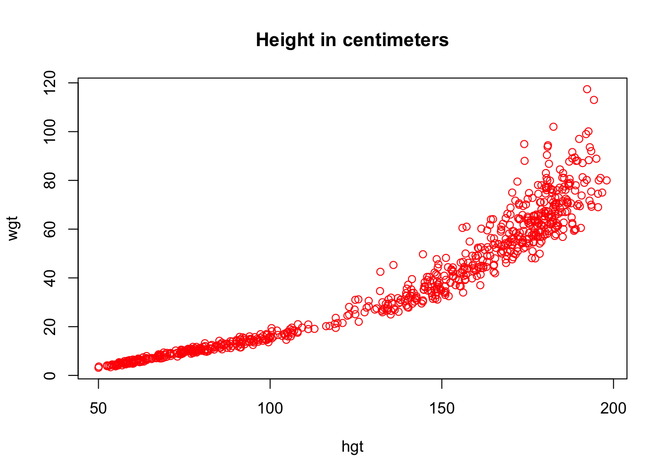
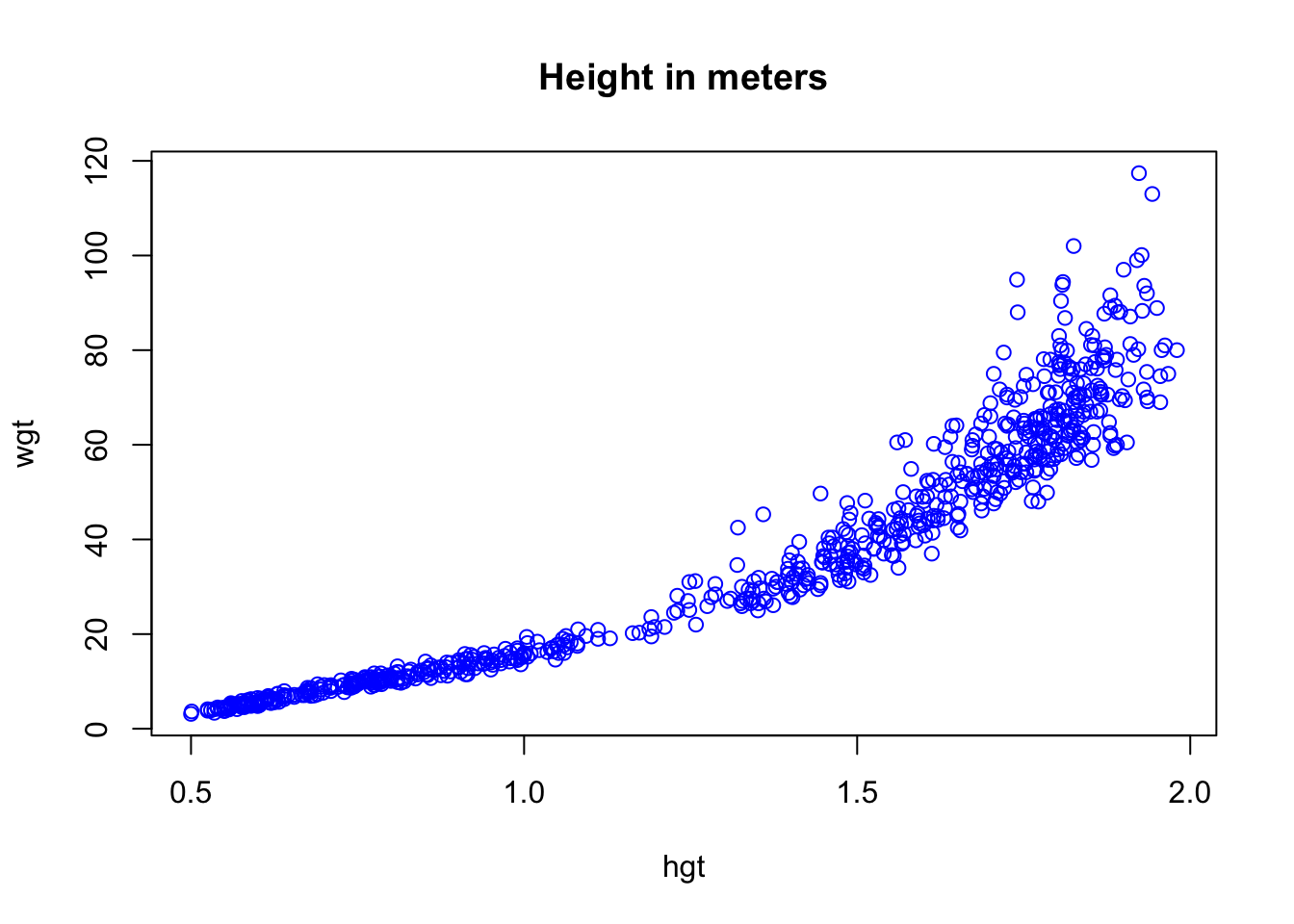
The %T>% pipe is very useful, because it creates a literal T junction in the pipe. It is perhaps most informative to graphically represent the above pipe as follows:
boys %>%
  subset(select = c(hgt, wgt)) %T>%
  plot(col = "red", main = "Height in centimeters") %>%
  transform(hgt = hgt / 100) %>%
  plot(col = "blue", main = "Height in meters")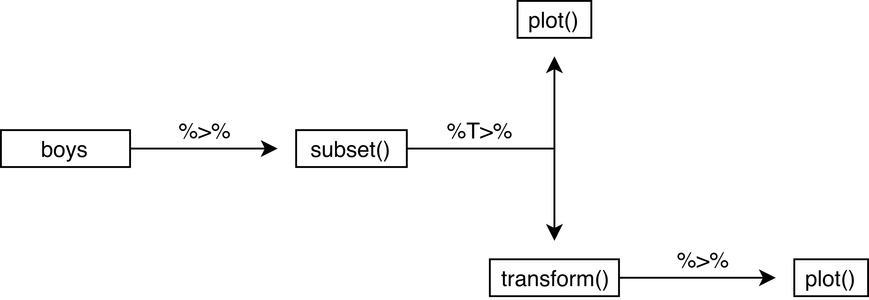
We can see that there is indeed a literal T-junction. Naturally, we can expand this process with more %T>% pipes. However, once a pipe gets too long or too complicated, it is perhaps more useful to cut the piped problem into smaller, manageble pieces.
Visualization
- Function
plot()is the core plotting function inR. Find out more aboutplot(): Try both the help in the help-pane and?plotin the console. Look at the examples by runningexample(plot).
The help tells you all about a functions arguments (the input you can specify), as well as the element the function returns to the Global Environment. There are strict rules for publishing packages in R. For your packages to appear on the Comprehensive R Archive Network (CRAN), a rigorous series of checks have to be passed. As a result, all user-level components (functions, datasets, elements) that are published, have an acompanying documentation that elaborates how the function should be used, what can be expected, or what type of information a data set contains. Help files often contain example code that can be run to demonstrate the workings.
?plotHelp on topic 'plot' was found in the following packages:
Package Library
graphics /Library/Frameworks/R.framework/Versions/4.2-arm64/Resources/library
base /Library/Frameworks/R.framework/Resources/library
Using the first match ...example(plot)
plot> Speed <- cars$speed

plot> Distance <- cars$dist

plot> plot(Speed, Distance, panel.first = grid(8, 8),
plot+      pch = 0, cex = 1.2, col = "blue")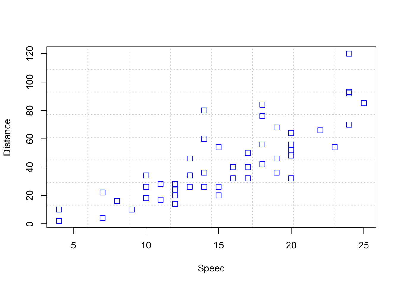
plot> plot(Speed, Distance,
plot+      panel.first = lines(stats::lowess(Speed, Distance), lty = "dashed"),
plot+      pch = 0, cex = 1.2, col = "blue")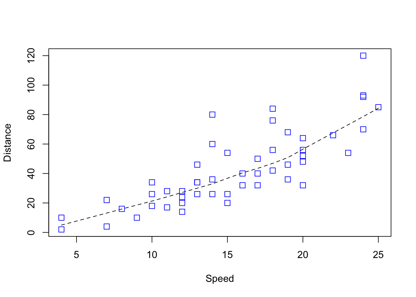
plot> ## Show the different plot types
plot> x <- 0:12

plot> y <- sin(pi/5 * x)

plot> op <- par(mfrow = c(3,3), mar = .1+ c(2,2,3,1))

plot> for (tp in c("p","l","b",  "c","o","h",  "s","S","n")) {
plot+    plot(y ~ x, type = tp, main = paste0("plot(*, type = \"", tp, "\")"))
plot+    if(tp == "S") {
plot+       lines(x, y, type = "s", col = "red", lty = 2)
plot+       mtext("lines(*, type = \"s\", ...)", col = "red", cex = 0.8)
plot+    }
plot+ }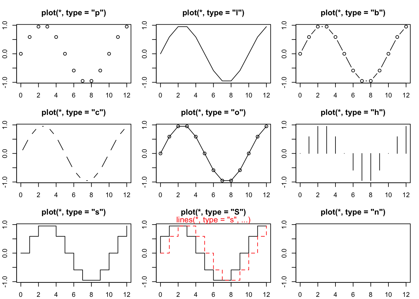
plot> par(op)

plot> ##--- Log-Log Plot  with  custom axes
plot> lx <- seq(1, 5, length.out = 41)

plot> yl <- expression(e^{-frac(1,2) * {log[10](x)}^2})

plot> y <- exp(-.5*lx^2)

plot> op <- par(mfrow = c(2,1), mar = par("mar")-c(1,0,2,0), mgp = c(2, .7, 0))

plot> plot(10^lx, y, log = "xy", type = "l", col = "purple",
plot+      main = "Log-Log plot", ylab = yl, xlab = "x")
plot> plot(10^lx, y, log = "xy", type = "o", pch = ".", col = "forestgreen",
plot+      main = "Log-Log plot with custom axes", ylab = yl, xlab = "x",
plot+      axes = FALSE, frame.plot = TRUE)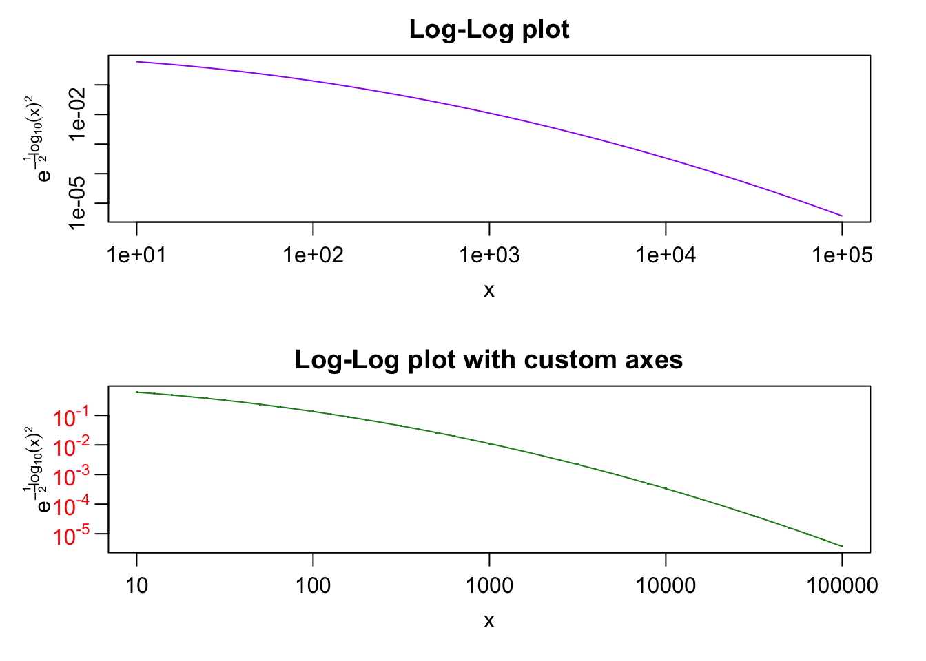
plot> my.at <- 10^(1:5)

plot> axis(1, at = my.at, labels = formatC(my.at, format = "fg"))

plot> e.y <- -5:-1 ; at.y <- 10^e.y

plot> axis(2, at = at.y, col.axis = "red", las = 1,
plot+      labels = as.expression(lapply(e.y, function(E) bquote(10^.(E)))))

plot> par(op)
There are many more functions that can plot specific types of plots. For example, function hist() plots histograms, but falls back on the basic plot() function. Packages lattice and ggplot2 are excellent packages to use for complex plots. Pretty much any type of plot can be made in R. A good reference for packages lattice that provides all R-code can be found at http://lmdvr.r-forge.r-project.org/figures/figures.html. Alternatively, all ggplot2 documentation can be found at http://docs.ggplot2.org/current/
- Create a scatterplot between
ageandbmiin themice::boysdata set
With the standard plotting device in R:
mice::boys %$% plot(bmi ~ age)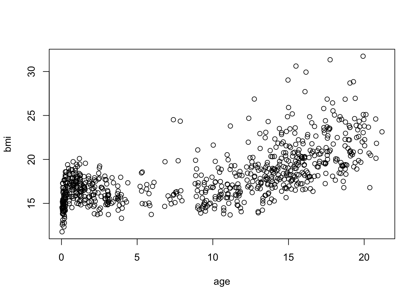
or, with ggplot2:
p <- ggplot(mice::boys, aes(age, bmi))
p + geom_point()
Warning: Removed 21 rows containing missing values (`geom_point()`).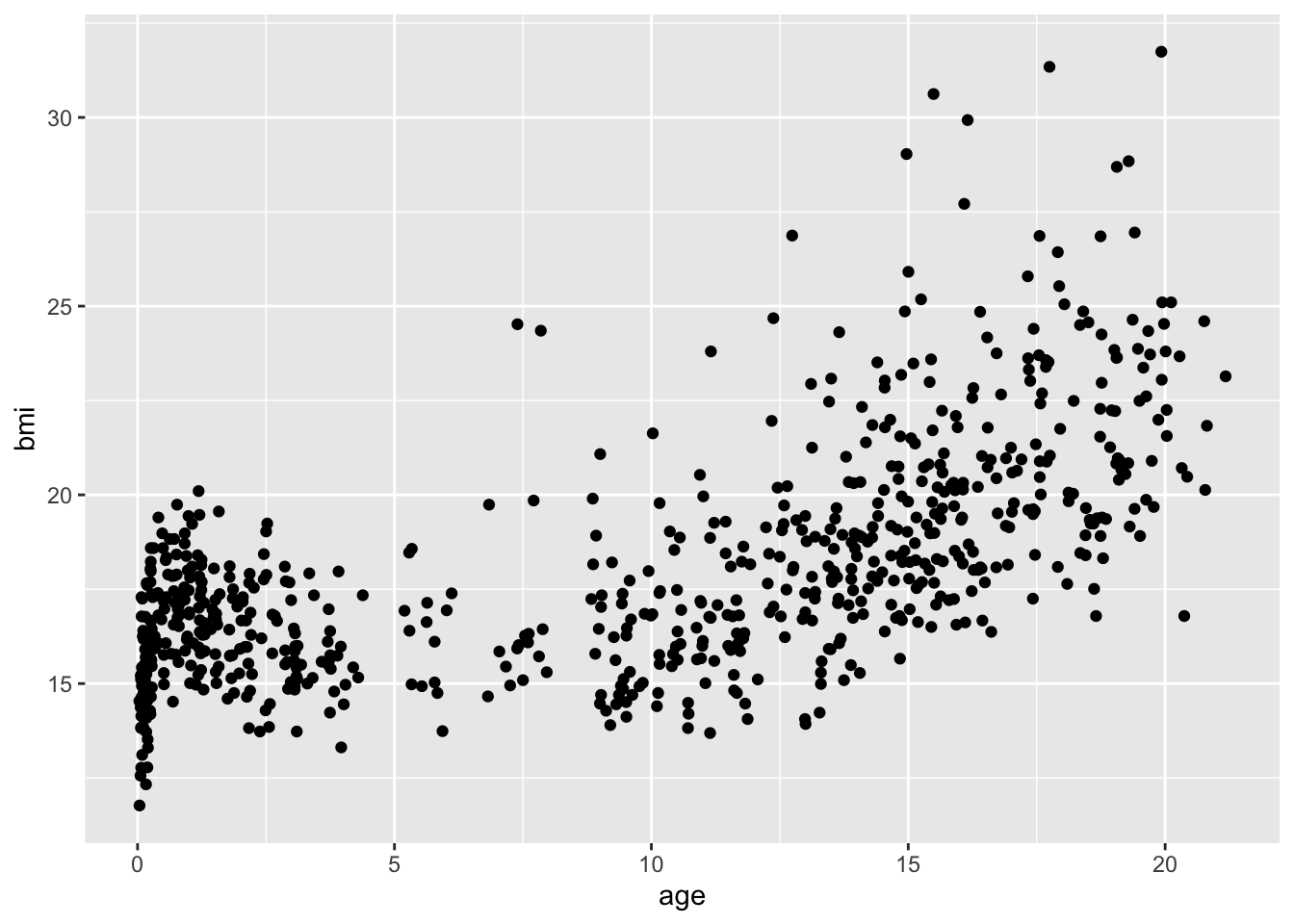
Package ggplot2 offers far greater flexibility in data visualization than the standard plotting devices in R. However, it has its own language, which allows you to easily expand graphs with additional commands. To make these expansions or layers clearly visible, it is advisable to use the plotting language conventions. For example,
mice::boys %>%
  ggplot(aes(age, bmi)) +
  geom_point()
would yield the same plot as
ggplot(mice::boys, aes(age, bmi)) + geom_point()but the latter style may be less informative, especially if more customization takes place and if you share your code with others.
- Now recreate the plot with the following specifications:
- If
bmi < 18.5usecolor = "light blue" - If
bmi > 18.5 & bmi < 25usecolor = "light green" - If
bmi > 25 & bmi < 30usecolor = "orange" - If
bmi > 30usecolor = "red"
Hint: it may help to expand the data set with a new variable.
It may be easier to create a new variable that creates the specified categories. We can use the cut() function to do this quickly
boys2 <-
  boys %>%
  mutate(class = cut(bmi, c(0, 18.5, 25, 30, Inf),
                    labels = c("underweight",
                               "healthy",
                               "overweight",
                               "obese")))
by specifying the boundaries of the intervals. In this case we obtain 4 intervals: 0-18.5, 18.5-25, 25-30 and 30-Inf. We used the %>% pipe to work with bmi directly. Alternatively, we could have done this without a pipe:
boys3 <- boys
boys3$class <- cut(boys$bmi, c(0, 18.5, 25, 30, Inf),
                   labels = c("underweight",
                              "healthy",
                              "overweight",
                              "obese"))
to obtain the same result.
With the standard plotting device in R we can now specify:
plot(bmi ~ age, subset = class == "underweight", col = "light blue", data = boys2,
     ylim = c(10, 35), xlim = c(0, 25))
points(bmi ~ age, subset = class == "healthy", col = "light green", data = boys2)
points(bmi ~ age, subset = class == "overweight", col = "orange", data = boys2)
points(bmi ~ age, subset = class == "obese", col = "red", data = boys2)
and with ggplot2 we can call
boys2 %>%
  ggplot() +
  geom_point(aes(age, bmi, col = class))
Warning: Removed 21 rows containing missing values (`geom_point()`).
Although the different classifications have different colours, the colours are not conform the specifications of this exercise. We can manually override this:
boys2 %>%
  ggplot() +
  geom_point(aes(age, bmi, col = class)) +
  scale_color_manual(values = c("light blue", "light green", "orange", "red"))
Warning: Removed 21 rows containing missing values (`geom_point()`).
Because there are missing values, ggplot2 displays a warning message. If we would like to not consider the missing values when plotting, we can simply exclude the NAs by using a filter():
boys2 %>%
  filter(!is.na(class)) %>%
  ggplot() +
  geom_point(aes(age, bmi, col = class)) +
  scale_color_manual(values = c("light blue", "light green", "orange", "red"))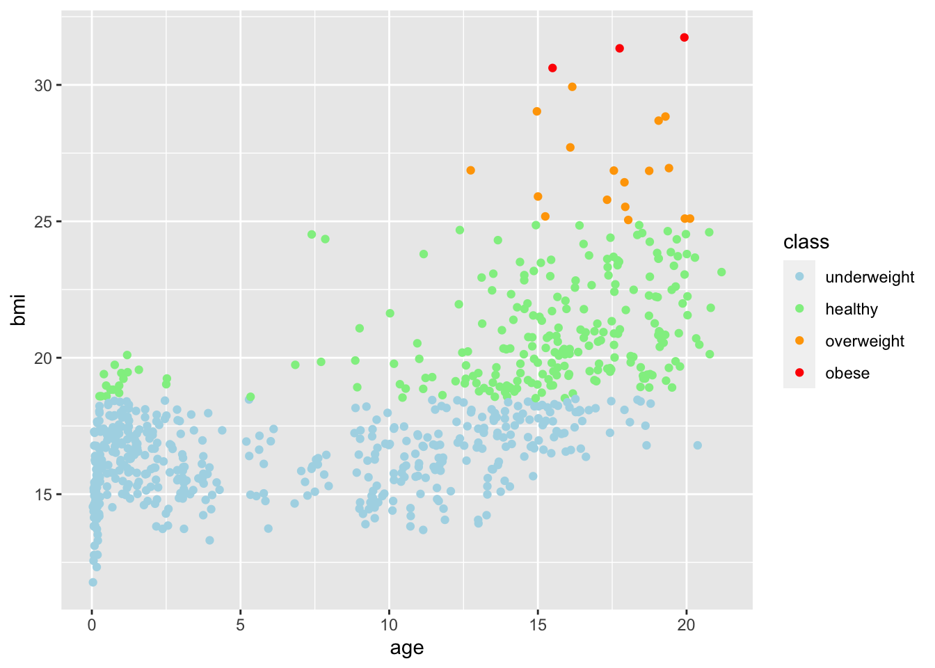
Specifying a filter on the feature class is sufficient: age has no missings and the missings in class directly correspond to missing values on bmi. Filtering on bmi would therefore yield an identical plot.
- Create a histogram for
agein theboysdata set
With the standard plotting device in R:
boys %$%
  hist(age, breaks = 50)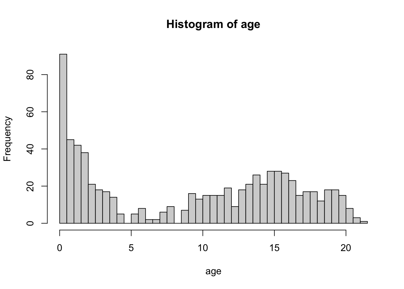
The breaks = 50 overrides the default breaks between the bars. By default the plot would be
boys %$%
  hist(age)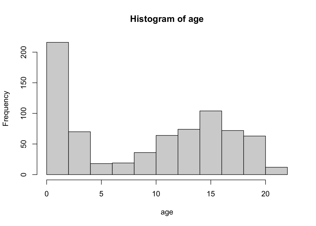
Using a pipe is a nice approach for this plot because it inherits the names of the objects we aim to plot. Without the pipe we might need to adjust the main title for the histogram:
hist(boys$age, breaks = 50)
With ggplot2:
boys %>%
  ggplot() +
  geom_histogram(aes(age), binwidth = .4)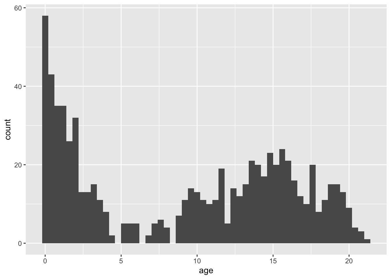
Please note that the plots from geom_histogram() and hist use different calculations for the bars (bins) and hence may look slightly different.
- Create a bar chart for
regin the boys data set
With a standard plotting device in R:
boys %$%
  table(reg) %>%
  barplot()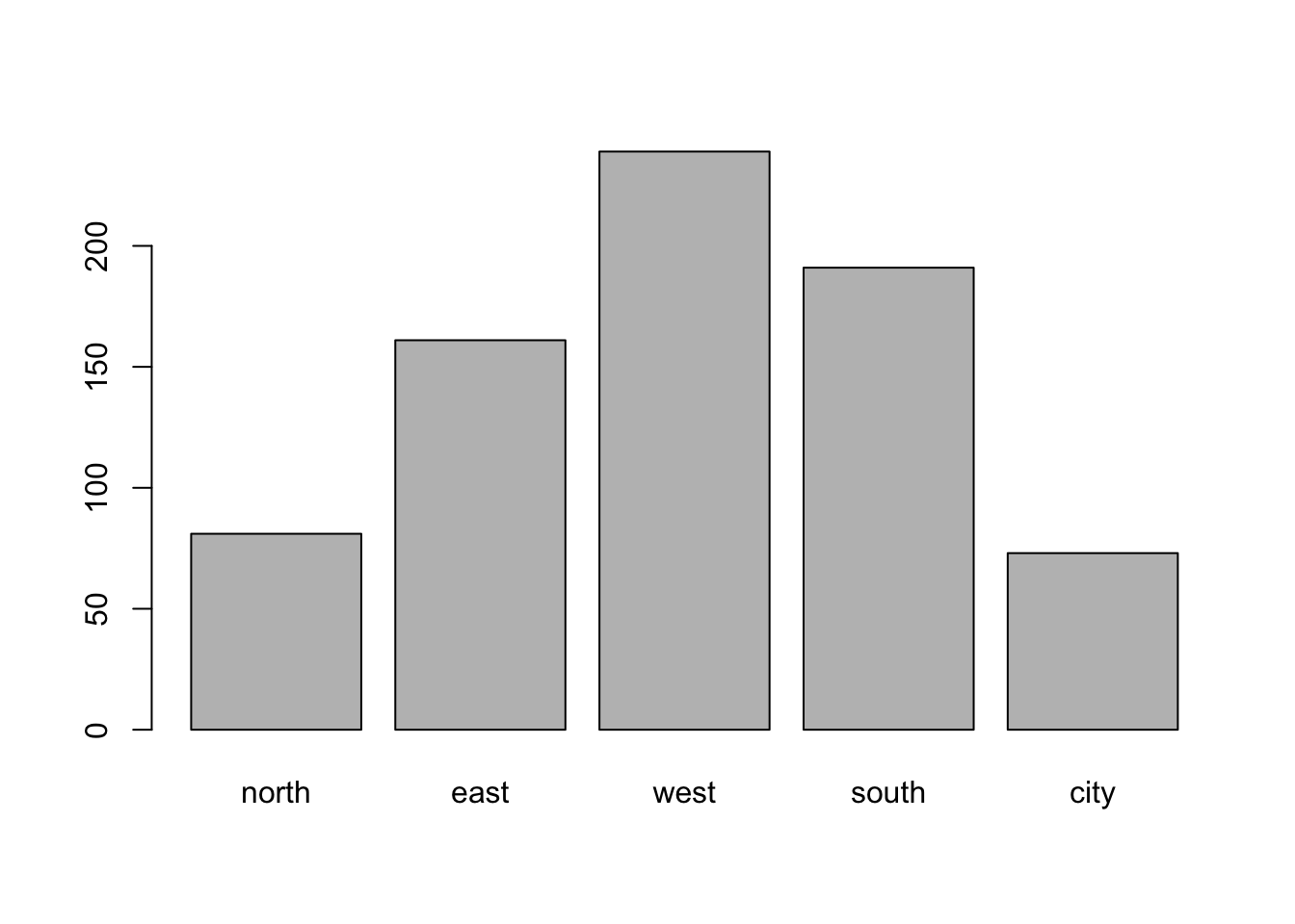
With ggplot2:
boys %>%
  ggplot() +
  geom_bar(aes(reg))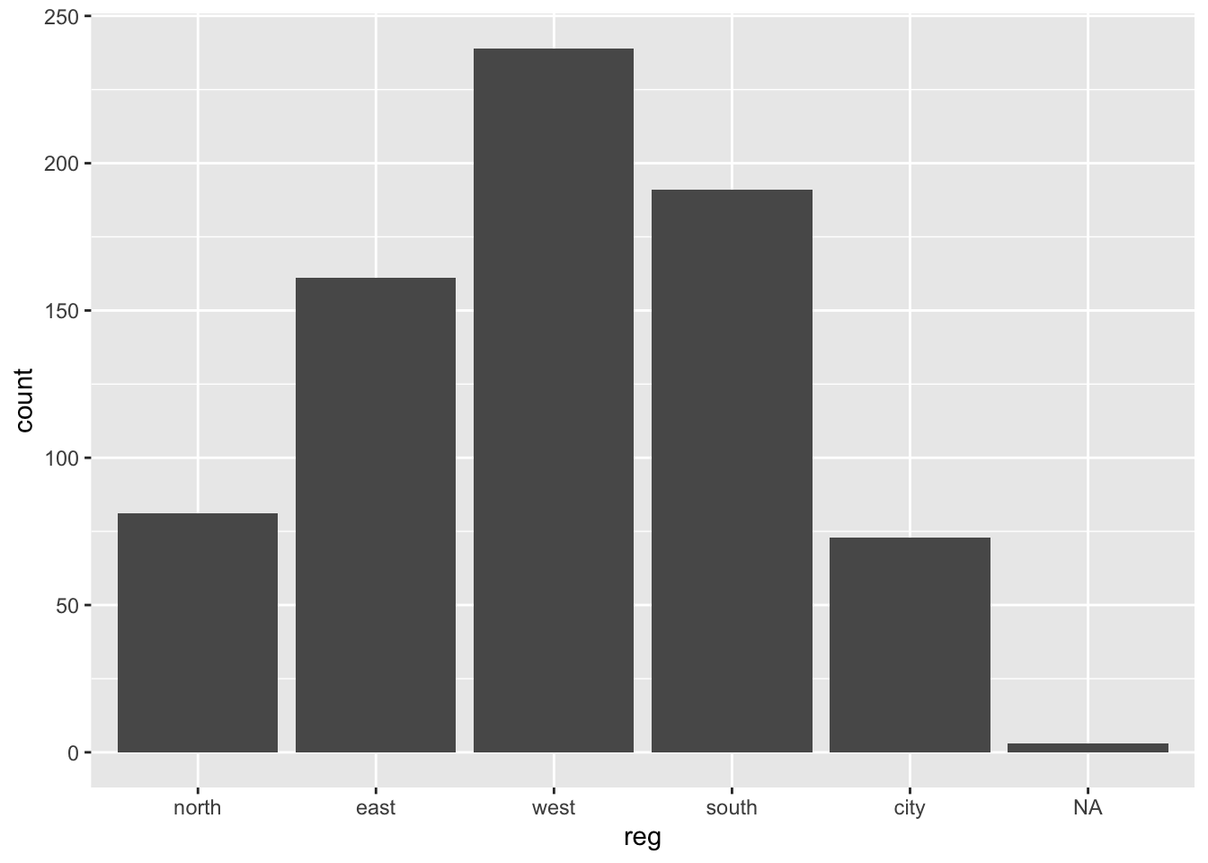
Note that geom_bar by default plots the NA’s, while barplot() omits the NA’s without warning. If we would not like to plot the NAs, then a simple filter() (see exercise 2) on the boys data is efficient.
- Create a box plot for
hgtwith different boxes forregin theboysdata set
With a standard plotting device in R:
boys %$%
  boxplot(hgt ~ reg)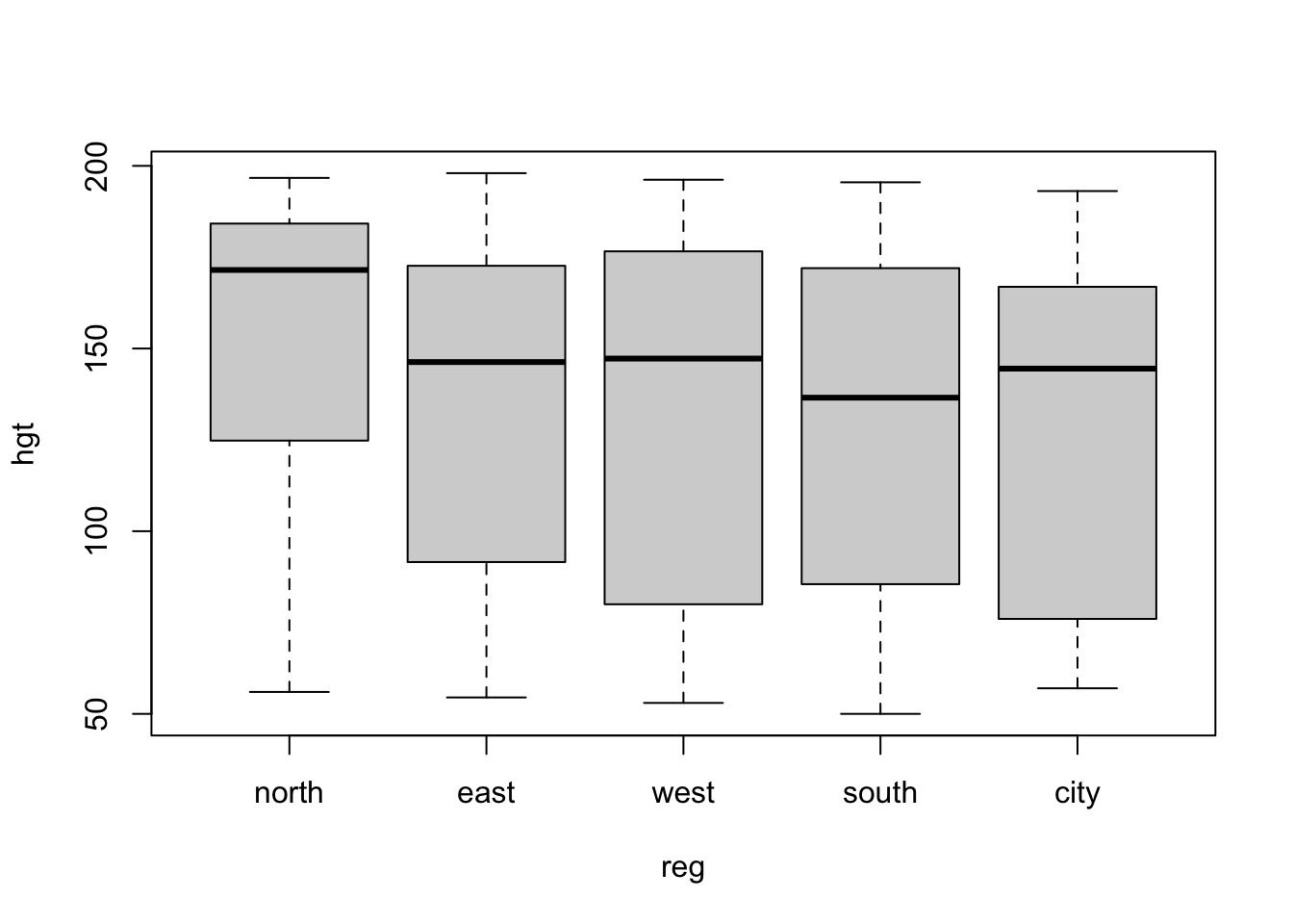
With ggplot2:
boys %>%
  ggplot(aes(reg, hgt)) +
  geom_boxplot()
Warning: Removed 20 rows containing non-finite values (`stat_boxplot()`).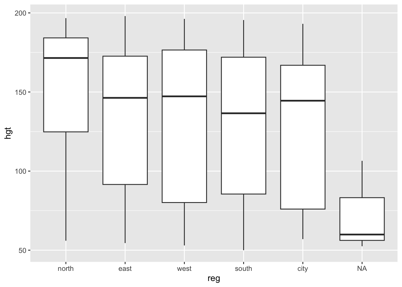
- Create a density plot for
agewith different curves for boys from thecityand boys from rural areas (!city).
With a standard plotting device in R:
d1 <- boys %>%
  subset(reg == "city") %$%
  density(age)
d2 <- boys %>%
  subset(reg != "city") %$%
  density(age)

plot(d1, col = "red", ylim = c(0, .08))
lines(d2, col = "blue") 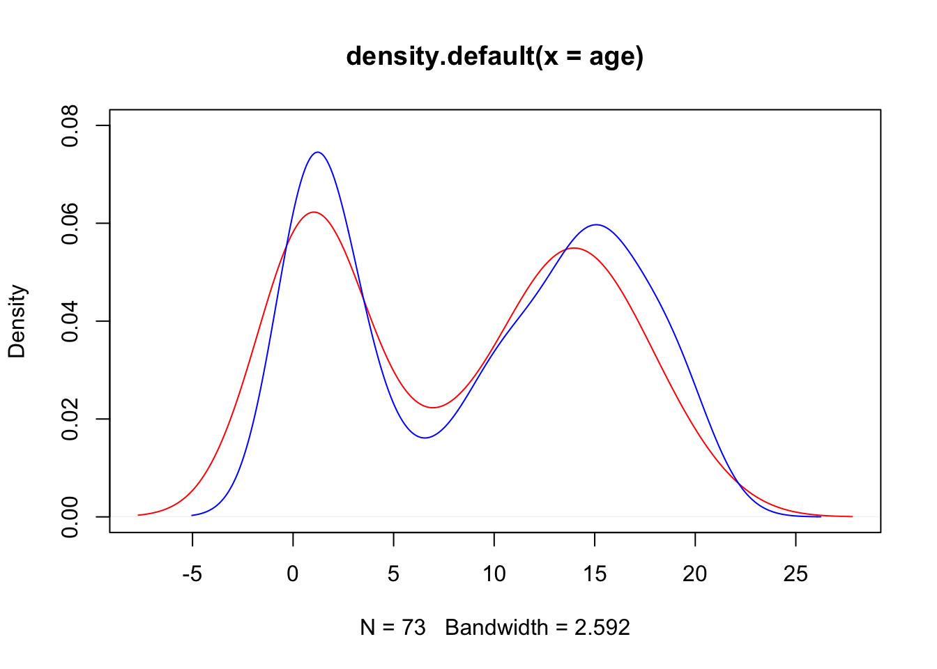
The above plot can also be generated without pipes, but results in an ugly main title. You may edit the title via the main argument in the plot() function.
plot(density(boys$age[!is.na(boys$reg) & boys$reg == "city"]),
     col = "red",
     ylim = c(0, .08))
lines(density(boys$age[!is.na(boys$reg) & boys$reg != "city"]),
      col = "blue")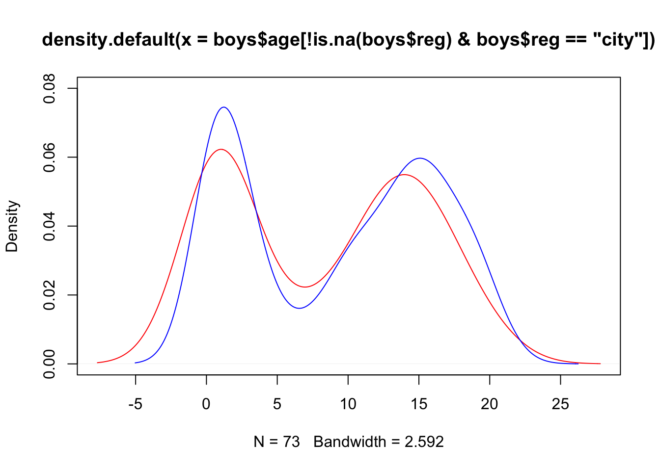
With ggplot2 everything looks much nicer:
boys %>%
  mutate(area = ifelse(reg == "city", "city", "rural")) %>%
  filter(!is.na(area)) %>%
  ggplot(aes(age, fill = area)) +
  geom_density(alpha = .3) # some transparency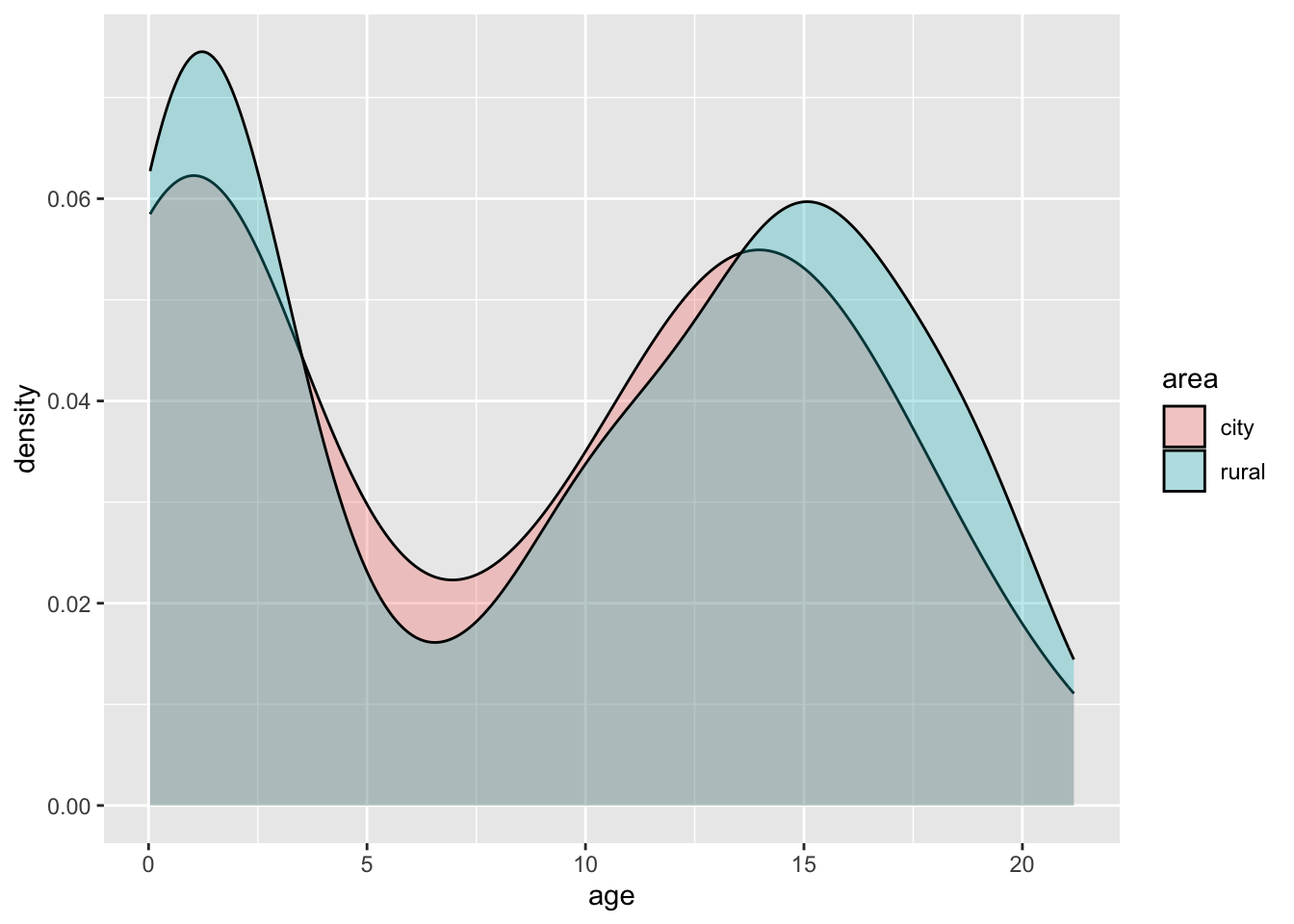
- Create a diverging bar chart for
hgtin theboysdata set, that displays for everyageyear that year’s mean height in deviations from the overall averagehgt
Let’s not make things too complicated and just focus on ggplot2:
boys %>%
  mutate(Hgt = hgt - mean(hgt, na.rm = TRUE),
         Age = cut(age, 0:22, labels = 0:21)) %>%
  group_by(Age) %>%
  summarize(Hgt = mean(Hgt, na.rm = TRUE)) %>%
  mutate(Diff = cut(Hgt, c(-Inf, 0, Inf),
                    labels = c("Below Average", "Above Average"))) %>%
  ggplot(aes(x = Age, y = Hgt, fill = Diff)) +
  geom_bar(stat = "identity") +
  coord_flip()
We can clearly see that the average height in the group is reached just before age 7.
The group_by() and summarize() function are advanced dplyr functions used to return the mean() of deviation Hgt for every group in Age. For example, if we would like the mean and sd of height hgt for every region reg in the boys data, we could call:
boys %>%
  group_by(reg) %>%
  summarize(mean_hgt = mean(hgt, na.rm = TRUE),
            sd_hgt   = sd(hgt, na.rm = TRUE))
# A tibble: 6 × 3
reg mean_hgt sd_hgt
<fct> <dbl> <dbl>
1 north 152. 43.8
2 east 134. 43.2
3 west 130. 48.0
4 south 128. 46.3
5 city 126. 46.9
6 <NA> 73.0 29.3The na.rm argument ensures that the mean and sd of only the observed values in each category are used.
- The previous exercise again, but now with
aggregate()in the solution.
Let’s not make things too complicated and just focus on ggplot2:
boys %>%
  mutate(Hgt = hgt - mean(hgt, na.rm = TRUE),
         Age = cut(age, 0:22, labels = 0:21)) %>%
  aggregate(Hgt ~ Age, data = ., mean) %>% #specify data = . to allow formula
  mutate(Diff = cut(Hgt, c(-Inf, 0, Inf),
                    labels = c("Below Average", "Above Average"))) %>%
  ggplot(aes(x = Age, y = Hgt, fill = Diff)) +
  geom_bar(stat = "identity") +
  coord_flip()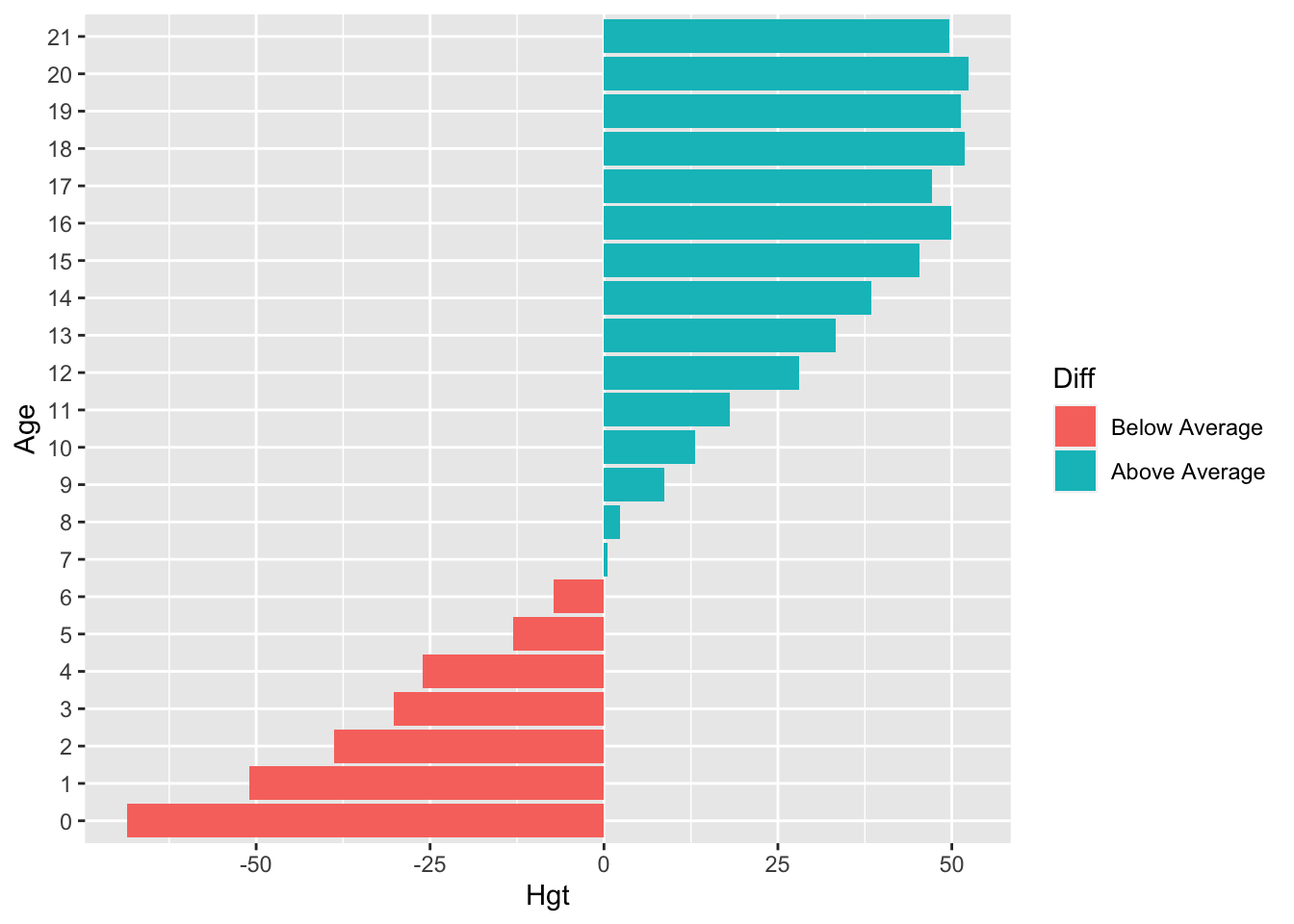
We can clearly see that the average height in the group is reached just before age 7. The aggregate() function is used to return the mean() of deviation Hgt for every group in Age.
For example, if we would like the mean height hgt for every region reg in the boys data, we could call:
boys %>%
  aggregate(hgt ~ reg, data = ., FUN = mean)
reg hgt
1 north 151.6316
2 east 133.9648
3 west 130.2783
4 south 128.0022
5 city 125.8577We have to specify data = . in order to allow for the formula-style call to aggregate() - where the method is of class formula. However, the data set boys is parsed down the pipe as an object of class data.frame. The default evaluation of argument would therefore be
aggregate(x, by, FUN)and in the pipe this is by default evaluated as
aggregate(., hgt ~ reg, mean)where . is the object parsed down the pipe. This . is automatically evaluated as the first argument, unless otherwise specified by the user. In most cases this works because the data is usually the first argument that is evaluated in a function. However, the result is not a valid call to aggregate() because the object we’re parsing down the pipe has class data.frame. aggregate() would therefor try to run aggregate.data.frame(), but our code dictates an evaluation of the formula call. By assigning the . to data = ., we specifically call for a formula evaluation of aggregate(). This solves the mismatch and forces aggregate() to conform to class formula:
aggregate(formula, data, FUN)which is evaluated as
aggregate(hgt ~ reg, data = ., mean)in the pipe. Problem solved!
The specifics about calling functions and evaluating their arguments can always be found in the help. Try ?aggregate to see all forms this function’s call may take.
End of Practical
Useful References
- The
ggplot2reference page magrittrRfor Data Science - Chapter 18 on pipes- Anscombe, Francis J. (1973) Graphs in statistical analysis. American Statistician, 27, 17–21.