Statistics, Pipes and Visualization
Gerko Vink 
Utrecht University
Methodology & Statistics @ Utrecht University
12/9/22
Being wrong about the truth
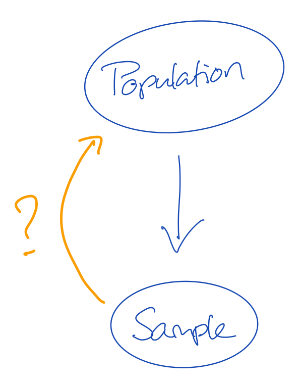
- The population is the truth
- The sample comes from the population, but is generally smaller in size
- This means that not all cases from the population can be in our sample
- If not all information from the population is in the sample, then our sample may be wrong
Q1: Why is it important that our sample is not wrong?
Q2: How do we know that our sample is not wrong?
Solving the missingness problem
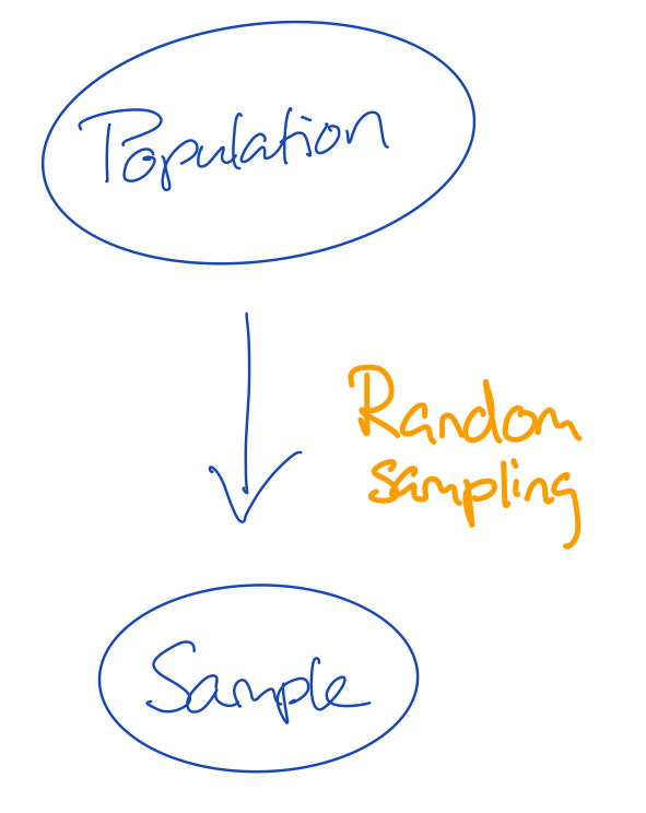
- There are many flavours of sampling
- If we give every unit in the population the same probability to be sampled, we do random sampling
- The convenience with random sampling is that the missingness problem can be ignored
- The missingness problem would in this case be: not every unit in the population has been observed in the sample
Q3: Would that mean that if we simply observe every potential unit, we would be unbiased about the truth?
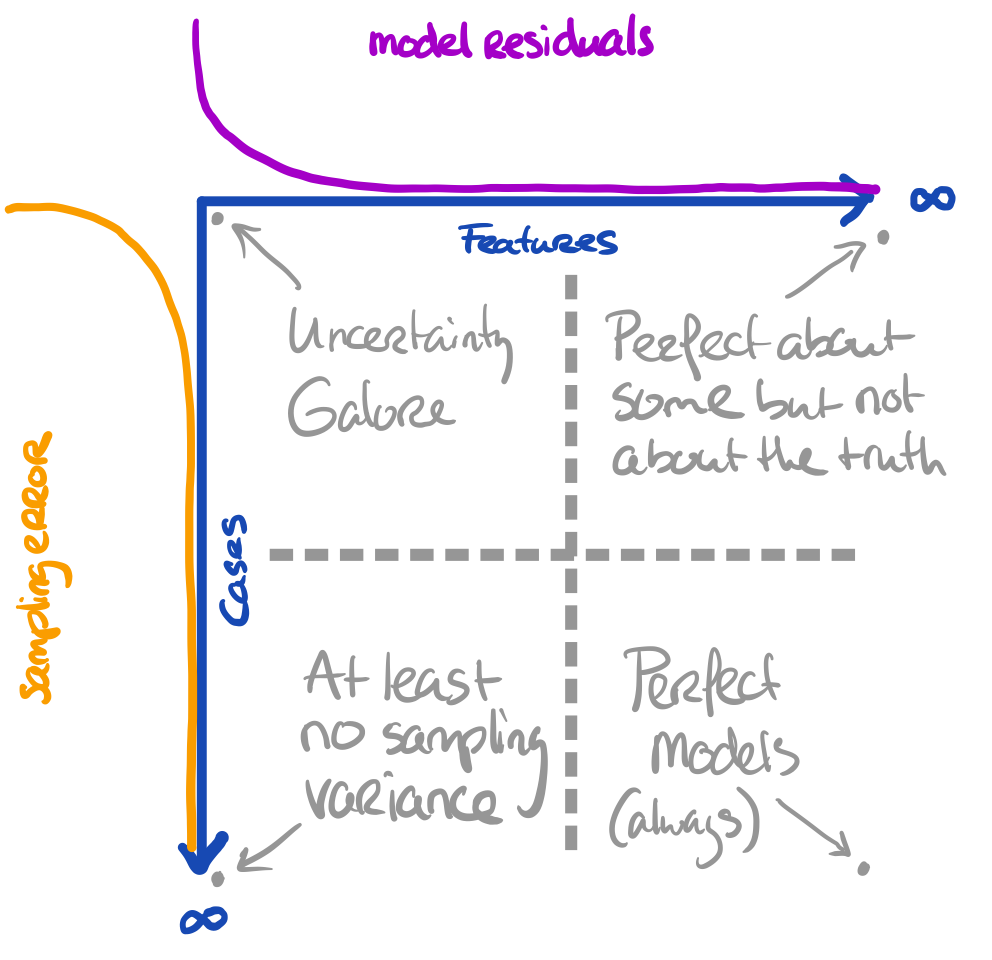
Sidestep
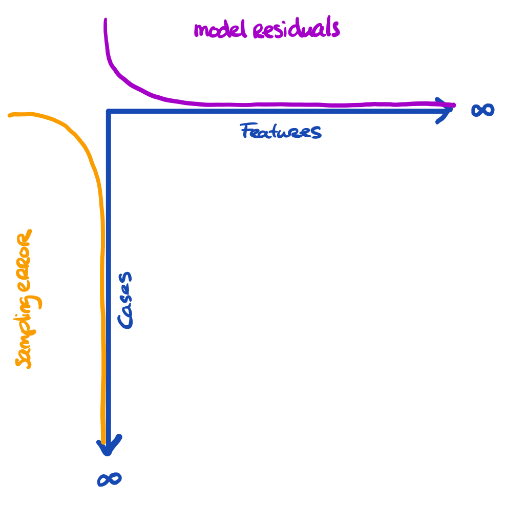
The problem is a bit larger
We have three entities at play, here:
- The truth we’re interested in
- The proxy that we have (e.g. sample)
- The model that we’re running
The more features we use, the more we capture about the outcome for the cases in the data
Sidestep
- The more cases we have, the more we approach the true information
All these things are related to uncertainty. Our model can still yield biased results when fitted to \(\infty\) features. Our inference can still be wrong when obtained on \(\infty\) cases.
Sidestep
Core assumption: all observations are bonafide
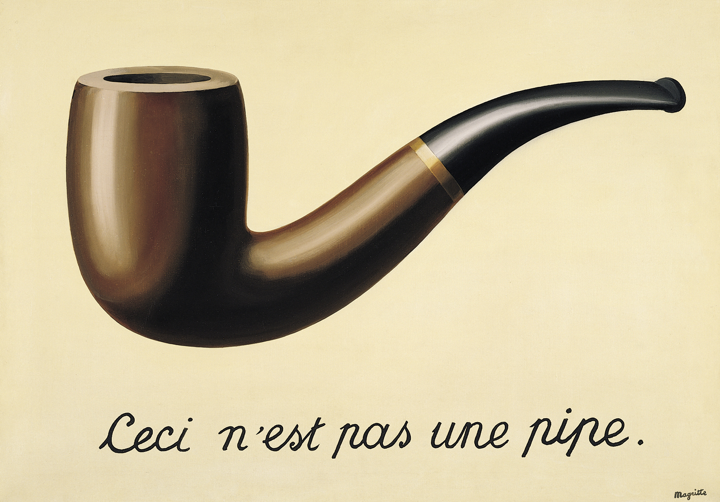
This is a pipe:
It effectively replaces round(cor(select(boys, is.numeric), use = "pairwise.complete.obs"), digits = 3).
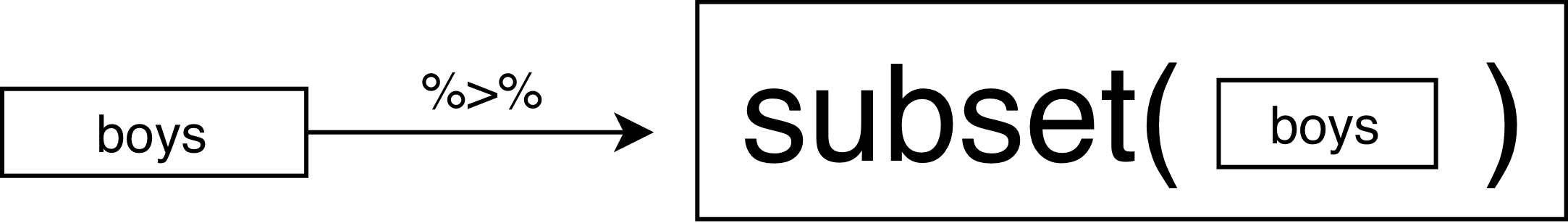
The standard %>% pipe
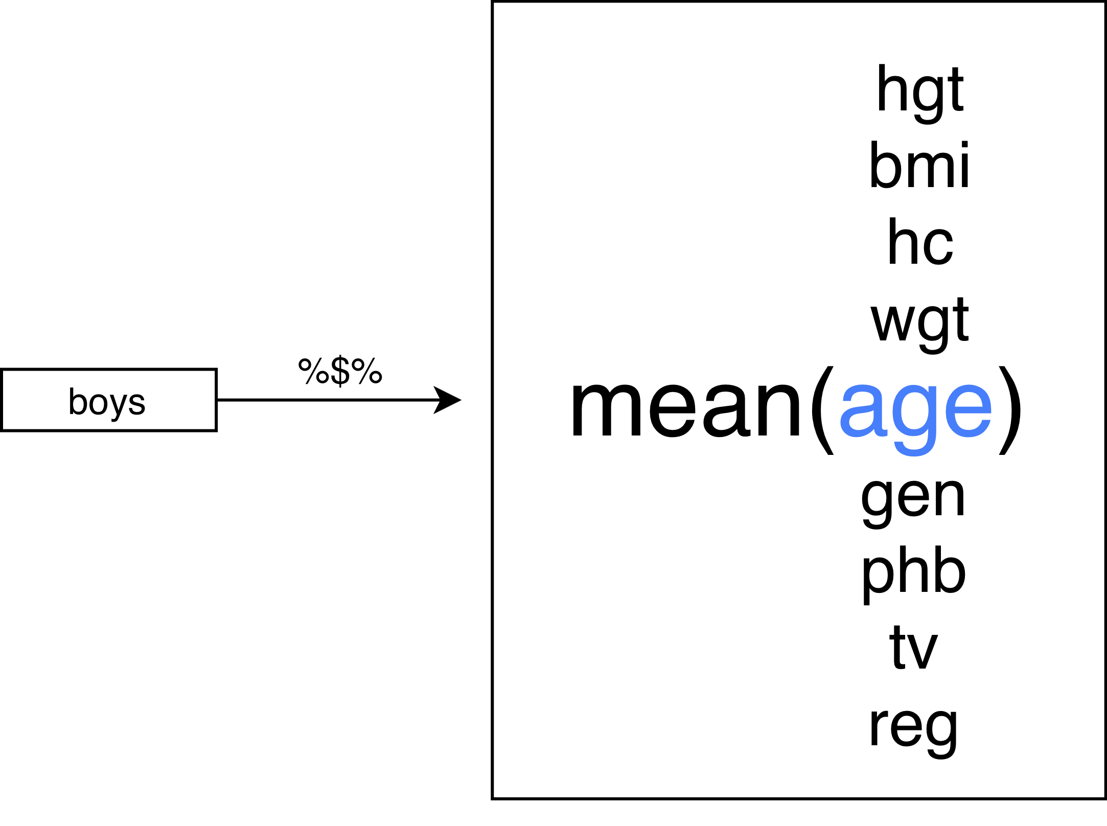
The %$% pipe
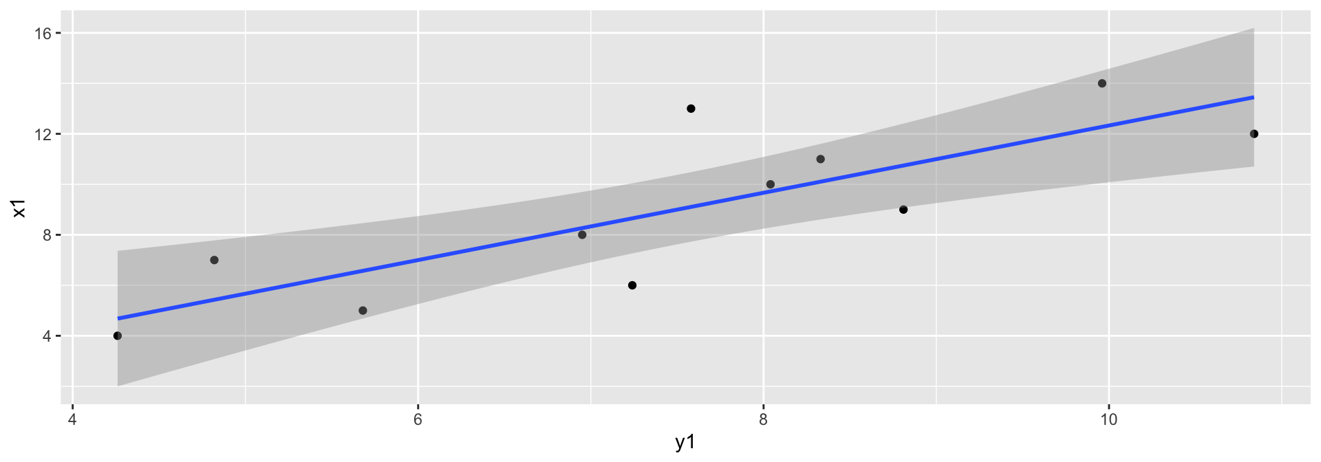
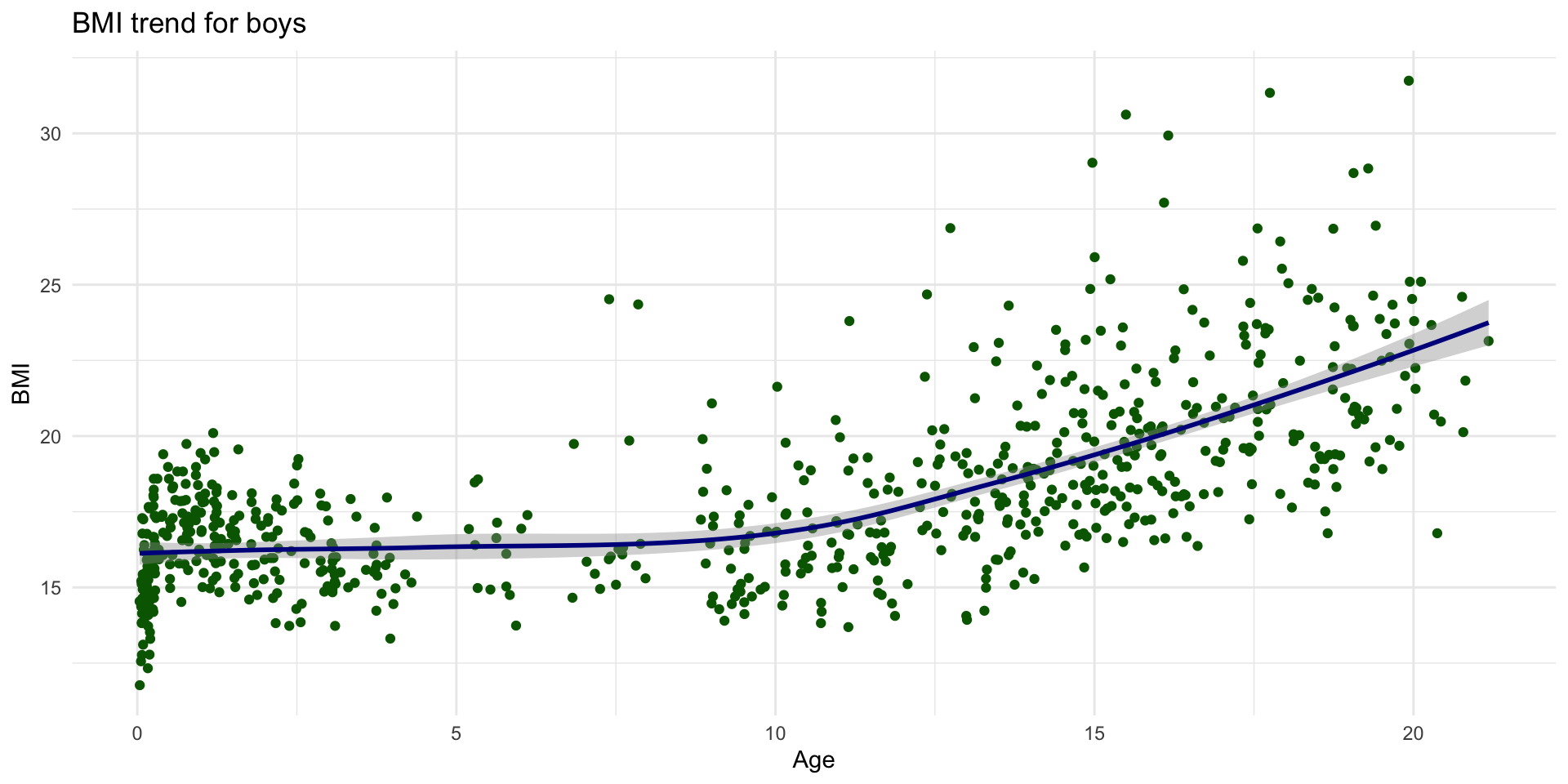
Fitting a line
Why visualise?

Why visualise?

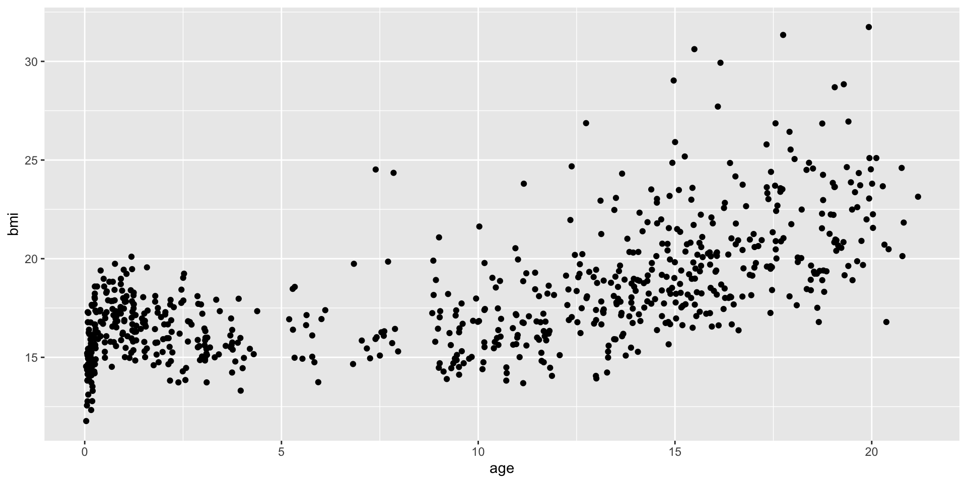
An example: scatterplot
Why this syntax?
Why this syntax?
Revisit the start
Is the same as